
Kinderpraktijk Nooms
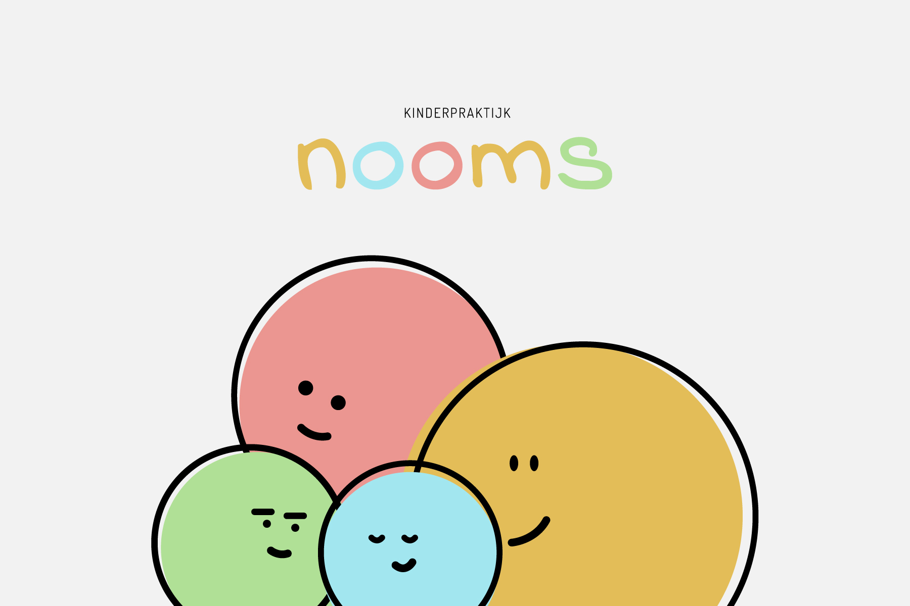
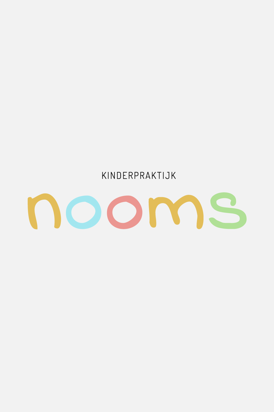
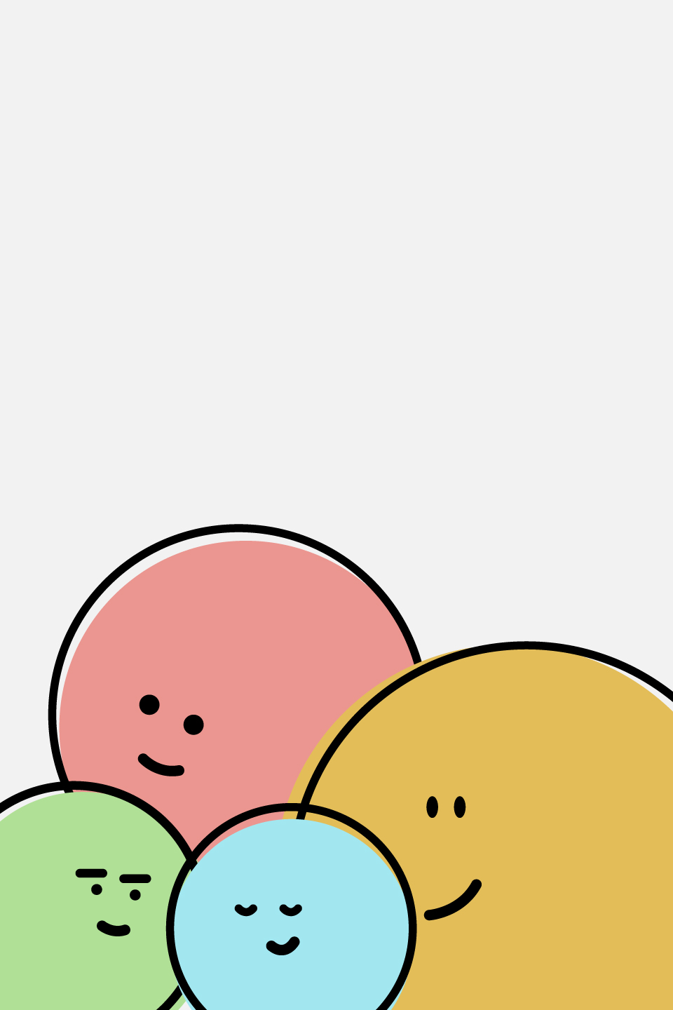
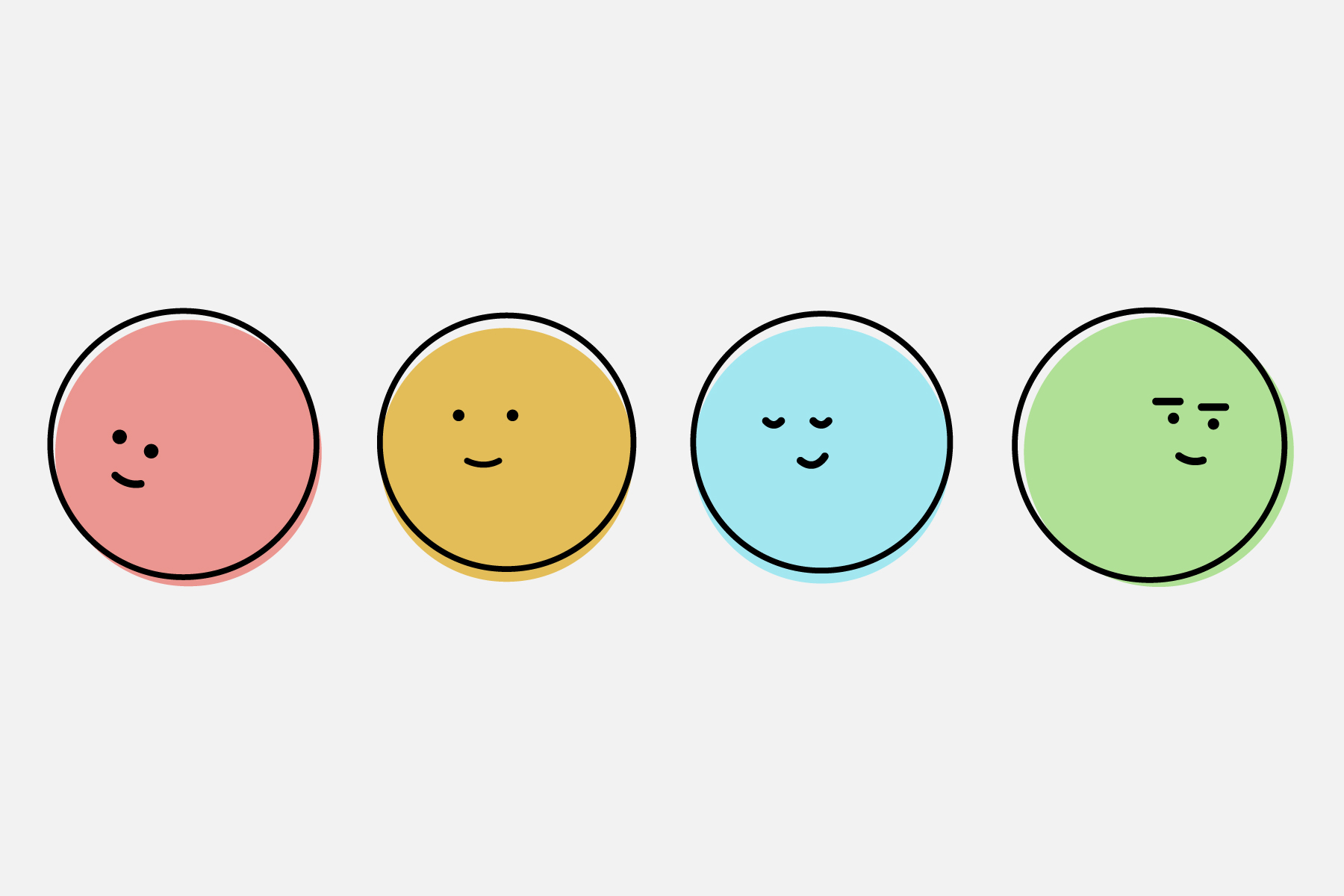
A start-up full of enthusiasm, Nooms, looking for a logo and branding to kick-start her company. As a pediatric physiotherapy practice, the corporate identity must appeal to the imagination and have cheerful colors. A logo based on some great illustrations was therefore the right approach. The faces give a cheerful atmosphere to the brand, the colors match the design of the physiotherapy practice. A childish character, without sacrificing credibility and professional appearance. A homely feeling, welcome to Nooms children’s clinic, where every child receives the help they deserve with a smile and a lot of fun.

Like what you see?
Let’s talk!
I’m eager to get to know your story.